Friday, 29 May 2009

trying something new


Hope you like this page, it's a little different to my usual style but I am trying to push myself a bit to use the stash I have got and make my titles more interesting.
Initially I wasn't even going to scrap these photo's as they were a bit dark but I decided to work with it and use the main colours and especially the red for impact.I don't know if you can tell from the photo but the word 'tourists' is cut out of shiny red foil which matches Kyle's and Freddy's clothes.
The word labels were fun and easy to do on the computer then print out in different font's and red ink. I like the effect of this sort of wording which you can normally buy in sticker form but I was trying to be frugle ( and complete the page today) but I will definately do it again. Why not have a go yourself and have some fun playing with font's colours and sizes.
My next post should be two lots of craft club challenges - as long as we don't have another power cut on Monday !

Saturday, 23 May 2009

Multi photo layouts

Here I am with another double layout - I have been trying to use up all the sets of photo's that I had printed a while ago. I much prefer to do single page layout's but have set myself the task of getting these done and being able to have a bit more space on the page to GO WILD !!!! (now you know me, I play strictly in my own little box) But watch this space I may surprise you - outside the box has been calling to me.
This Center Parcs layout was done using BasicGrey's Urban Prairie papers, I wasn't very pleased with my title, although I had to distress it and go around the letters with black pen so that they would blend with the papers I have been getting lazy with my title's layout. This is where I must think more about being creative with my titles in future instead of just leaving a space and then sticking some die cut letters in.
I was in Ipswich shopping the other day and just popped into WHSmith's to check out magazines and what did I find but a brand new mag. It seemed very expensive - £5.99 ! But on inspection it's the best scrapbook mag I 've seen, It's not for beginners as it's not your usual layout. It has no demonstrations or techniques, no letters from readers, just page after page of beautiful scrapbook pages (with a half dozen cards thrown in.) When I looked up their web site it is an American mag that has been re-edited for the British market but I do prefer the American style of scrapbooking (it just seems tidier if that makes sense).
I shall bring it to the next club meeting so you can all see it. In the meantime here is a picture of the front cover if you want to go check it out yourself.

And this is a picture of my favourite layout in the mag. I just like the bright colours and the ripped papers.

I popped in to see my friend Helen the other day and we decided to have a challenge between the two of us - to do a page using this paper ! It is another BasicGrey sheet this time from the Eva line , I really do like BasicGrey at the moment, even my craft club challenge from last week I have used another different line of theirs.
I will post our layout's ( if Helen let's me that is ?) to show you how we both got on. Apparently Helen has already finished hers so I had better get my thinking cap on ( if I can find it - last seen under a pile of ironing).
Thanks for stopping by. Kerry.


Sunday, 17 May 2009

craft club blackout

We had just set up the craft club on Monday and everyone was arriving when the electricity went off!! So we had a look at everyone's mini kit challenge layouts and cards but it was getting too dark to take photos of them to post on this blog but we were sure the power would come back on within a few minutes.
How wrong we were, at 8.45pm we decided that it was even getting too dark to stay and chat so we started to pack away. Just as we were starting to leave the power came back on!!!!!!!!! A bit disappointing to say the least especially as our next meeting can't be for three weeks due to another bank holiday.
But I have given everyone a sketch challenge to be getting along with and we will all bring our layouts to the next meeting and I will post them all then.

This next layout I started with a sketch from the last Creativity Life magazine but didn't follow it to the letter ( But then I rarely do) I found this lovely paper that I could cut around the flowers to make it more interesting and then because the paper was quite busy anyway it didn't need much more on there so I just cut some more flowers and placed them on top of the others using some foam pads. I decided to add lots of gems to jazz it up a bit.
click on the image to see up close. Thanks for looking.


Monday, 11 May 2009

Quick makes

This was my quick make from last night, sometimes it's quite satisfying to just do simple layouts as it's finished and put in your album. I have been waiting for the opportunity to put a tape measure on a layout and I thought that during sports day measuring takes place in the form of distances run and how far things are thrown, so that was my thinking behind the tape.
My journaling is hidden behind one of the photo's and if you click on the image you can see I have done a bit of doodling on the title letters.

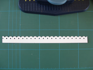
This layout was easy but a little more time consuming as I experimented on making the trim that I have placed under the photo's. I have put instructions below.


First take a Fiskars Threading Water Border punch and punch along the piece of cardstock, you want to have quite a long piece of card as it's easier to manage.


Next measure from the back of the paper guide to the front of the hole as shown ( mine is 9 1/2 mm ).

Next carefully measure your distance from the back of the hole and mark with a sharp pencil.
Do this at intervals along your cardstock.


You should then join all your pencil marks up with a ruler like in photo below.


Then trim along the pencil line with your trimmer so you are left with a strip like this.

Insert your strip into your punch again making sure that the straight edge of your cardstock strip is against the paper guide and line up the holes as in the photo below.


Continue carefully punching until you have reached the end of your strip and hopefully you should end up with this.......


I hope these instructions make sense, don't forget you can click on the photo's to see close up.
Email me if you need further instructions.


Sunday, 3 May 2009

winter walk


I know I should be doing some spring pages but I already had these photo's and the paper selected to take to my friend Helen's house to crop, but there was more chat than scrap going on as usual! So I thought I would scrap them anyway and luckily the circle snowflakes were the same size as one of my punches (how often doe's that happen?) so I didn't have to cut them by hand as they would not have looked quite like circles.
To save paper I cut a frame out of the green Bazzil and mounted it on the pink Bazzil instead of trimming the pink and mounting that on the green ( am I making sense? ) The W was a chipboard negative spruced up with glitter and some snowflake brads added and the other letters of the title were cut from funky foam which was just the right colour to match the red in the pattern paper ( how often doe's that happen!!!!) then I glittered them with Stickles.
I hope you enjoyed my ramblings, feel free to leave a comment.