Tuesday, 25 November 2014

Ibiza Life is Good.

I am sharing a double page again today that I created for the tic tac toe challenge over at 1 2 3  Get Scrappy.

I used the top row for my layout.

Here is my double page, created using Pink Paisley's Indigo Blue line.
The photo's are of my youngest daughter and the cats that hung around the villa in Ibiza. 
Please excuse the shadow at the bottom of the pages, there was so little light here in the UK in the past couple of days!

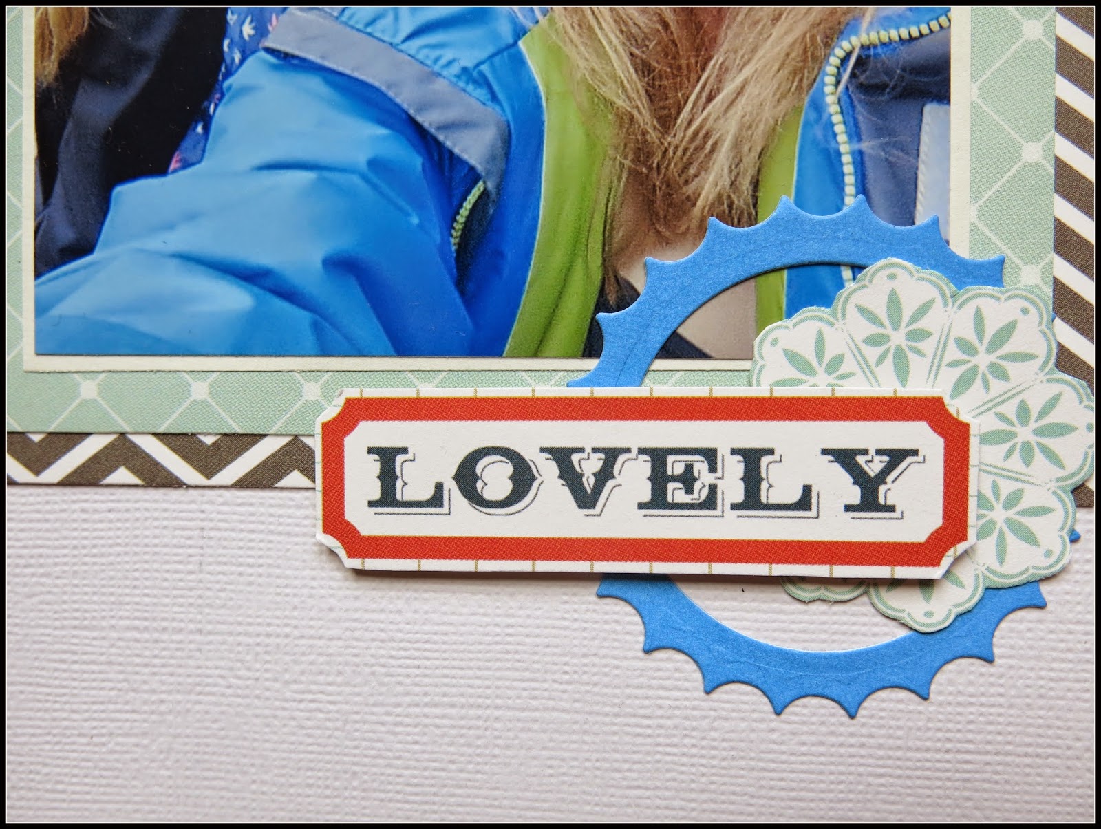
A close up of the right hand page. 
The banner was fussy cut from one of the sheets of paper.

The left hand page.

A closer look at the banner.

A rosette flower made using a Tim Holtz die.

More fussy cutting from a flower patterned paper.

For details on how to play along with the challenge at 1 2 3  Get Scrappy hop on over to their blog HERE.

Thanks for stopping by today.


Thursday, 20 November 2014

Do Not Disturb.

After several days of rainy weather here in the East of England we have beautiful sunshine and temperatures that don't require you to go out in a coat! I have not been outside except to hang out the washing though as I have been clearing a bedroom ready for decorating. But I am taking a break from the dust bunny chasing to share a page I created for the current sketch challenge over at Stuck?

Here is the cute sketch.

This is my take on it with a slight change of the amount of photo's. 
I have very few single photo's left to scrap so I am compromising with two smaller photo's of the cutest cat on the block! (not that I'm biased!).

I haven't used my cloud dies for ages so I thought I would dust them off and add some on this layout along with some punched hearts.

I cut this little fella from one of the sheets of paper in an American Crafts paper stack.

Hope you can play along with the Stuck? challenges too this month, they have such fun and inspiring sketches to get that mojo going.
All the details can be found on their blog HERE.

Thanks so much for dropping in. xx

Tuesday, 18 November 2014

Good Day.

Sharing another double page with you today as I am working my way through some older photo's. 
To help me I searched for a versatile sketch and I came across a superb one over at Scrap Much?

I liked this sketch as I would be able to continue my photo's onto another page once I turned it on it's side.

Here is the double I made, the left side was based the sketch.

A closer look at the sketch inspired page.
I trimmed the photo's down as much as I could and just managed to squeeze them on.

And the right hand side incorporating the rest of my photo's from
our day out at Dover Castle.

My title which I cut on my Silhouette was placed among
the fussy cut flowers.

I love the look of these scribble circles combined with
some bright ink and more of those flowers.

To link the two pages together I added more circles and flowers
to the right hand page along with another cut file saying.

This fun sketch from Scrap Much? runs until the end of the month, you can find details on the blog HERE.

Thanks for stopping by today. xx


Saturday, 15 November 2014

Big Thunder Mountain.

The fifteenth of the month is reveal day for Sketch N Scraps last (but not least!) layout sketch of the month. This time designed by Kelly Holifield, with an Autumnal feel.

Here is the sketch we are sharing with you today.

Here is my take on this sketch and as you can see I have used the sketch for the left side and carried on some of the sketch elements to the right.

A close up of the sketch inspired page. I am currently scrapping a Disney album with photo's from way back in 2011. As I am a little snap happy with the camera I have plenty of pics to scrap so the album is going to be fairly basic and I am determined to use up some older papers with it too.

The right hand side with a similar design.

I couldn't believe I got this title out of some really old Basic Grey sticker letters! So many of my sheets of lettering are get impossible to make titles from with only a few select vowels remaining!

I really hope you can join us this month, I know we are all busy with preparations for Christmas, school events and generally catching up on life's little drama's but remember to take some time out and play to recharge those batteries!

All the details of how to play along can be found on the Sketch N Scrap blog HERE. Along with the rest of this month layout and card sketches.

Have a wonderful weekend. xx

Friday, 14 November 2014

Mummy's Little Helper.

I am running around chasing my tail lately so although I have a scrapbook layout to share with you today it was actually created last weekend and I am just getting around to posting it!
I have dug out some old papers and teamed them up with the November 1st challenge over at Stuck? Sketches.
Here is the sketch.

Here is my layout featuring our lovely, cuddly pussycat. He is helping me by laying along my warm ironing board so that I could take a break from my favourite pastime!!

My title was made up from different alpha's and placed on the tags as in the sketch.

This scalloped bunting (banner) was cut from the patterned paper. I cut a whole load of stars using my Nestabilities and arranged them to my liking.

To play along with this sketch check out the details over at the Stuck? Sketches blog HERE.

Thanks for stopping by and I will be back tomorrow with a double pager!
Hugs. xx

Monday, 10 November 2014

Family Time and a Design Team Call.

With November charging along I am chasing my tail with so many projects in the pipeline, but have stopped in today as it's the reveal of Sketch N Scrap Inspired By Challenge for this month.

Here is the cool sketch that is based on a layout by DT member Marie-Christine.

I have created a double pager for this challenge as I have several sets of multiple photo's to scrap.

Here is the page that was based on the sketch and I replaced the hexagons with stitched arrows.

This is the second page with the rest of the photo's in the set showing my family enjoying walking in our local woods and fields.

The stitched arrows were randomly placed until I was happy with the number and colours.

All the paper I used for these pages was from the Teresa Collins Family Stories line, the frame and flower were just cut from one of the sheets.

I added some more arrows onto the second page in the small gap that remained after all the photo's were placed.

One last embellishment.

I know you are going to enjoy playing along with us with this sketch, so to see the rest of the DT's takes and Marie-Christine's original layout pop on over to the Sketch N Scrap Blog HERE.

Design Team Call!

Sketch N Scrap is excited to announce we are accepting applications for new design team members!  If you love creating with our sketches then please consider applying.  We are in search of creative, fun, reliable designers of all styles and experiences who are open to creating BOTH cards and layouts using our awesome sketches! No experience is necessary and international members are welcome to apply!  

Click HERE for details on the DT call.

I am so grateful you stopped by and hope to see you again very soon. xx


Sunday, 9 November 2014

Wild Thing.

Hi crafty friends just popping in quick to share a layout I completed over the weekend for the current sketch challenge over at Scrap365.

Here is this month's sketch.

Here is my page based on the sketch and features one of cats who is sixteen years old and started loosing her teeth! She only has one top fang left and this photo kind of makes her look a little fierce but she is actually yawning! 

My background was made with water colour paints, I would love to have a go at Gesso's but they are so expensive that I will have to make do.

Lots of my favourite embellishment - fussy cut pattern paper and some frames that were a freebie.

I love the idea of putting wording on a photo and the space available on this picture of Molly was perfect for adding part of the title using white rub-on's.

Well that's it from me today (told you it would be quick, gotta get on with Sunday dinner!) but there is still seven days left to participate with Scrap365. You can find the link to their blog HERE.

Thanks so much for stopping by. 
Back tomorrow. xx


Saturday, 8 November 2014

Friendly Challenge.

I hope your weekend is fabulous so far, with plenty of good things to do and great people to do them with.
My weekend started on Friday with a day out to see my dear friend Helen and to share the challenge layouts we had done.
We have a new system of deciding what our next challenge will be, it used to be whatever we could think of  that we hadn't done before. But I gave out six envelopes each recently and we put a challenge into every one, sealed them up and now we just get someone to pick an envelope for us each time we need a new challenge.
This time around we had one of Helen's envelopes and the challenge inside said
'Using punches and dies only, create a page. Any medium can be used and any embellishment'.
As it was Helen's challenge I will share her page first.

Her adorable page features a pet rat of one of her daughters. 
As you can probably tell from the title she had curly whiskers! Not a usual thing for rats to have but she looks so cute with them.
Helen has totally rocked the challenge with nearly all the elements of her page being die cut! 
She created the background with paint and cut hexagon's for the main design of her layout.

These butterflies were cut from balsa wood and the black bead embellies look so much like the rats eyes!

The beads and doily are the embellishments Helen added that were not die cut, but this cute banner is and the heart strip that disappears under the photo. 
Well done Helen for a great job of sticking so well to the rules.

This is my interpretation of Helen's challenge but I failed slightly by mounting one of  my photo's on a piece of pattern paper that I cut with my trimmer!!!! (Luckily Helen forgave me and we are still friends!).
Anyway these photo's of my eldest daughter (who loves to take selfies) were taken at Colchester Zoo and feature a large bronze lion statue that I think she fell in love with! Perhaps she kissed him to see if he would turn into her prince (because who would want to kiss a frog?). 
The title 'Kiss Me Quick' is the name of a song sung by Elvis Presley back in the 60's and I thought it suited the photo's.

The rosette flower was cut with a Tim Holtz die and the white leaves, flower and banner were also cut from various die's although I'm not sure of the manufacturers. 

These rectangles under my title are really old Sizzix dies as I promised myself to use some dies that I don't remember using before! I love the effect though so they will probably get another airing at some point.

There we have it, another friendly challenge that was fun to play along with as always. We hope you enjoyed seeing our interpretations, we have a sketch to follow for our next one which will hopefully be in a few weeks.  
Thanks for stopping by today. xx

Friday, 7 November 2014

Happy Mail.

Hi there scrappy friends, I'm so happy because it's FRIDAY! This is my favourite day of the week as not only have I not got work but I usually get to do something nice with friends or family.

Today has it's good and bad points, it's the reveal of the November challenge over at Challenge YOUrself (definitely good!) but it is also my last one as I have stepped down from the design team (most certainly not good!). I am hoping to start a new venture next year so thought I had better make a little time in my schedule. I have totally enjoyed being on Lynn's awesome team this year and hope to still play along to keep myself scrapping about 'me'. 

So onto the challenge for November - a sketch to kick start your mojo.
We would love to see your interpretation of the sketch BUT remember that YOU MUST be in the photo as that's what these challenges are all about!  

So here is my layout based on the sketch and it features me showing off some happy mail. We all love to receive crafty goodness through the post and if it's a prize - even better! I used the pretty papers that I received in the box from My Creative Sketches, fussy cutting the frames to use in place of the circles in the sketch. 
I also added the piece of ribbon, wrapped around the layers of papers and tied in a bow.

I layered pieces of the papers on top of some vellum, tucking some of the frames in between at the edges.

A scattering at the top of the page of some of the MME buttons in the box.

I managed to make my title from some old Basic Grey letters. and added some chevrons for a bit of colour and interest at the bottom of the page.

I hope I have inspired you to play along and if you hop on over to the Challenge YOUrself blog HERE you can see the rest of the DT's interpretation of the sketch. 

Thanks so much for stopping by today. 
I will have some more scrappiness to share over the weekend. xx